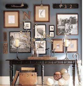
As a designer, I have found that people struggle the most with selecting and placing artwork. Some view art as a "place holder" or as a statement piece. Either way art is personal. Much different than my background in design for model home merchandising that is based on a broad demographic, selecting artwork for a home is rather difficult. While I could go into much more detail on types and styles of artwork, lets take a look at a simple artwork solution. What I have found is that a gallery wall is a great way to fill a space while also expressing yourself and personal style. Now very commonly done, I have seen a lot of great executions of pairing art, photographs, and various memorabilia. And then I have seen things that are not so great and make me cringe. Before I tell you some simple guidelines for executing this in your own home, know that its most important to stay true to your style. If you are a minimalist, I am going to assume you are not a fan of the typical gallery wall. BUT you would probably be more suited to large scale collections in pairings. Or if you would consider your style to be more rustic and casual, then you would most likely see yourself having a mix of textures, sizes, and subject matter. Keep that in mind as we dig in. Decorate your home for you!
Don't hang your random leftover pictures/picture frames to create a photo gallery wall. Lets move past the wall decal anchoring this flat and uninspiring photo wall, and focus on the amount of nails that were required to install this mess. As a rule, lets just go ahead and say that 4x6 frames do not belong on the wall. For just a photo wall though, Do either a. add texture or color with your frames if you have a more relaxed style or b. consolidate your images to either larger scale prints or frames for more structured design (examples below) While I wouldn't want such thick heavy frames with the small matte as shown, you could salvage this photo wall by hanging pieces closer together. You will make more of an impact by spacing your frames a couple inches apart to create a smaller overall piece than spacing it out to fill a greater amount of wall space.
a. mixed textures and sizes
b. modern and clean lines
Don't overwhelm your guests or yourself with wordy (and usually cheesy) quotes. I am all about song lyrics, bible verses, clever puns, and southern expressions. However, I don't feel you need to cover your walls in these things. I feel like this could be a metaphor for dating and maybe its the binge watching of queer eye on Netflix, but I imagine Tan or Karamo giving a struggling bachelor this advice. "Don't give it all away at once" or "leave a little mystery." It seriously stresses me out when I see something like this.
I am 100% on board with all of these expressions. Aesthetically it is overwhelming. This is an instance where maybe we have too much texture, multiple typography types and not enough visual resting space. I love this gallery wall installation that spaces out our quote with eclectic mixed art pieces.
Do... use pairs and patterns. As a rule, I like to work in groups of two's and three's. Keep quotes to a minimum of two or three and fill in with photos, art and dimensional pieces. This also works well with collections. You could have 3 framed vintage postcards, 2 charcoal figurative sketches on deep colorful matte, and four black and white photographs. While randomly placed provides an eclectic experience, you can create a more curated and traditional arrangement by keeping pairs and collections together. Take a look at these two examples that I feel are executed perfectly.
Do embrace the monochromatic gallery wall. No matter your style, you can make a statement with consistent colors and subject matter. Unlike our first example that had no interest and grew flat, you will see with these three examples how consistency can make a huge impact.
Do go big or go home. In design you can always break the rules. I typically agree with the sentiment "less is more," but Iris Apfel says "more is more and less is a bore" and I also agree with that. There are very certain ways to break the rules, so here are a few examples on how to gracefully break the rules.
At the end of the day, let your personality shine through your collection of art. The key is balance. Balancing scale, texture, color and subject matter, will give you a cohesive gallery wall.


